
Are you getting your e-commerce website organised for the Christmas season ahead?
The easier it is for your website visitors and shoppers to find what they’re looking for on your website, or have your website show up in Google searches (SERPs – search engine results pages) with a great SEO strategy, the better.
You don’t want to give your shoppers or website visitors the chance to close out of your website and go somewhere else, do you, so we want to make that last step of checking out their purchase as easy and seamless as can be.
It doesn’t matter if you have the best E-Commerce website, but if your checkout page is less than rocking, you risk losing a potential customer when you’d gotten that far.
A customer who has added a product to their basket and is hovering over the purchase button is not one you want to scare away with a poorly optimised checkout system.
So, let’s maximise your e-commerce checkout page to provide a rocking shopping experience to your website visitors.
1. One step checkout
Limiting the number of steps in your checkout is a great way to increase the number of purchases in your store. Just like a general rule of thumb is to find what someone is looking for within 3 steps. It’s also very similar to the checkout process on an e-commerce store. You want your customer to be able to complete their purchase within as few steps as possible.
For the love of all things chocolate, please do not have a 10 step checkout process.
Those days should be long gone.
Give your customers the option of a one-step checkout where they can fill in all their details on a single page, before completing their purchase.
2. Guest checkout
Everyone is often time poor and in a hurry, and we usually want things yesterday. So, give your website visitors the option of a guest checkout to get on with their day and other shopping goals.
Consider including an option for guest checkouts for those website visitors who don’t want to take the time to make an account.
Making someone create an account when they don’t want one and don’t want one could be a roadblock in your user experience (UX) and cause them to jump off your website and go elsewhere.
There’s many reasons why customers don’t want to share all their information with you. So respect that and give them a choice, and they can decide if they register or check out as a guest. Win/win.
3. Cart contents and summary
Are you like me? If you’re buying a few things, you want to see everything in one easy glance before you hit the checkout button.
I might want to:
- Change something
- Add something extra
- Increase/decrease the quantity
And I want to see how much it’s all costing me. No one wants to have to tally it up; they or I don’t. So, have your website do the hard lifting and tally it up too. Take any risk of losing your customer at this stage of the checkout experience.
4. Payment methods
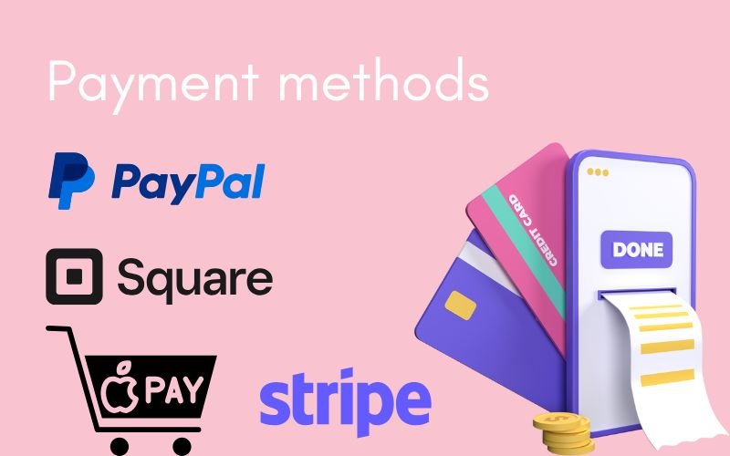
Again, options are great for customers. No one wants to be forced into using a payment method they don’t really want to use. And every shopper’s preference will no doubt be different. So, again, options are great.
Some customers may prefer:
- Credit cards,
- Others may prefer the no-fuss security of using PayPal or Stripe.
Try to include a selection of payment methods for ease of checkout.
5. Build trust
A well designed and secure checkout page also builds trust with your customers and shoppers. And when customers feel confident that their information is safe and that the process is straightforward, they are more likely to complete their purchase and tell others about their positive experience.

6. Encourage repeat purchases
A positive checkout experience can also help to build customer satisfaction and loyalty, encouraging them to return and make future purchases.
When the checkout process is smooth, customers are more likely to return in the future and again tell others, aren’t they? I know I do.
7. Save abandoned carts
This is a great feature. No doubt, your life gets busy, and we have the best of intentions to sit down and shop, or we might be trying to fit some online shopping between appointments, meetings or at school pickup time. Sound familiar?
But my point is, we can get interrupted. Or perhaps I can’t quite decide.
So, saving my abandoned cart and having my shopping basket automatically populate again when I log back on provides such a positive UX you’ve made me happy before I even have a chance to look around your web store again.
Also, taking a step further and sending an abandoned cart email is excellent for when your shoppers get distracted and forget to return. An excellent digital marketing tactic is a little push or prompt with a reminder email, a remarketing ad on socials, or even a discount or special incentive to get them back to your website. It again provides a positive UX (well, not the ads sometimes, as they annoy me, if they keep popping up).
8. Shipping and postage options
Make your shipping and postage clear. You don’t want your customer spending time shopping and adding to cart, etc and making their way through the checkout process to find that the postage cost isn’t what they were expecting or want to pay.
We all know postage can vary greatly, so I always recommend being upfront and clear about your shipping and postage. And that includes whether your postage also includes handling.
Unclear shipping terms and options can immediately turn customers away from purchasing, especially if they want their item urgently.
If they can’t see the available postage or shipping options and the cost, your website visitors will likely look elsewhere.
Keep your customers and shoppers happy
Make your e-commerce checkout experience as easy as can be, as it’s essential for converting potential sales, enhancing customer satisfaction, and ultimately maximising sales for your e-commerce business. And we all want that, don’t we?


0 Comments